
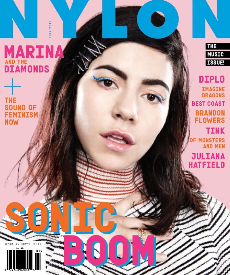
Nylons demographic of young women aged between 18-30 makes their default covers fresh, vibrant, punchy whilst bold and empowering utilising content that is relevant to womens lifestyle choices ranging from fashion, beauty, relationships, music and much more.
It's interesting to see that across Nylons covers across the world they all share common factors beyond Nylons brand guidelines, it seems that the ongoing graphic design and photography trends isn't regional but global as covers and editorials share a similar aesthetic.
Rainbow became an exceedingly big trend all throughout 2015 from various magazines picking up on how monochrome was seen as dated and colourful or pastel was inspiring everyone to start wearing colour again.

I find it very i interesting to see similar formal elements in the aesthethic, using the same models poses to sharing the same sticker art, a current trend in both fashion and art amongst illustrators.
As fashion and lifestyle attributes often get recycled, we're also seeing an emmergence of retro from the 90s, using Notepad simple typography, glitchy graphics, 35mm disposable camera film being used as editorial spreads. It feels like the world has gone so far in technological advancement that creatives are seeking inspiration further back in time. As an creative myself, I'm trying not to be persuaded by current trends of art that I want to tap into, but whilst learning about how to make yourself known it's hard not to accept and give into current art trends in editorials and reflect your inspirations into your own work.

I've been reading Nylon for years, and it was always my go to for artistic inspiration, and whilst this captivating time of pastel and rainbow is upon us, perhaps we should be channeling a diversity amongst art and varying covers. It's always interesting to find common factors within work and see it accelerate but at the same time will Nylon refresh it's current look to fit the future, or will it remain pastelised for years when the trend has burnt out?


No comments
Post a Comment